19.2 Causal Loop Diagrams
Michelle McCully
Learning Objectives
By the end of this chapter, you will be able to do the following:
- Explain the meaning of nodes, edges, positive connectors, and negative connectors in CLDs.
- Identify positive and negative feedback loops and double negative regulation in CLDs.
The problems biologists have to deal with are often complex and interconnected. Systems thinking deals with such complex questions. It has been described as a “language” that can help describe and communicate the complex, interdependent issues biologists face on a daily basis.
The causal loop diagram (CLD) is one of the tools in the systems thinking toolbox. It was first developed in the 1960s and continues to be a powerful tool to describe, quickly identify, and analyze the relationships between the interacting elements of a system. They are used across biological fields as well as in business and engineering. Within biology, they can be used across scales to describe systems from the molecular to the population level.
A causal loop diagram is a visual representation of the complex net of relationships and dependencies, focusing on the pairwise relationships that build up the system. It can tell you how one part of the system network influences other parts, and patterns in causal loop diagrams can help you predict the system’s behavior. Similarly, a causal loop diagram can be used to identify the most efficient strategies to intervene in a system or predict how changes might influence the system.
1. The Language of Causal Loop Diagrams
The causal loop diagram consists basically of two types of visual elements: nodes and edges.
The nodes in the diagram are the components of the system. Think of nodes as biological objects with potentially measurable quantities, such as a small molecule and its concentration or a protein and its activity.
The edges (the arrows) represent how nodes are connected. If one node’s change influences or causes another node to change, there will be a connection or edge between them. The direction of the arrow indicates the direction of the influence, and the shape of the arrow tells you how the first object influences the second.
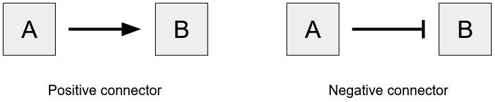
A positive connector, drawn as an arrow, indicates that the first node had a positive influence on the second. In other words, as the concentration, activity, or amount of A increases, that of B increases as well. A positive connector might be appropriate when A causes B to begin or increase its activity, A creates B, or A causes the amount of B to increase.
A negative connector, drawn as a T-bar, indicates that the first node has a negative influence on the second. In other words, as the concentration, activity, or amount of A increases, that of B then decreases. A negative connector illustrates when A causes B to stop or decrease its activity, A consumes B, or A causes the amount of B to decrease.
Together, the nodes and edges can create complex networks and, more importantly, loops. Finding these loops is the point of the exercise, as the name causal loop diagram may have given away.
2. CLD Motifs
The power of using the common language of causal loop diagram is that you can identify the types of processes going on in the loop by identifying common motifs such as double negative regulation, negative feedback loops, and positive feedback loops.
Double Negative Regulation
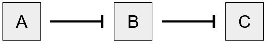
Double negative regulation occurs when there are two nodes connected by a negative connector and then the second node is connected to a third node, also by a negative connector. This relationship indicates that there is a positive relationship between the first and third nodes, in other words, as A increases, C increases also. However, if there is no direct interaction between A and C, it is important not to draw a positive connector between them. Doing so would negate the importance of the two negative connectors and remove your ability to make predictions about the system in a situation where one of the negative connectors was affected.
Negative Feedback or Balancing Loops
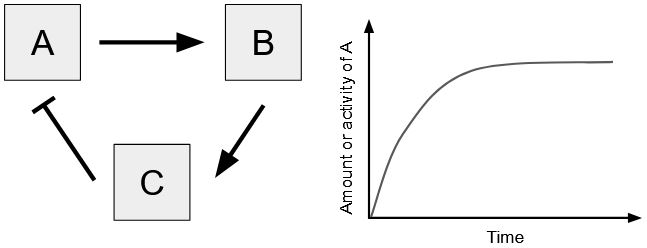
If you can trace a loop in your causal loop diagram, determining what type of loop it is will help you understand what is going on in your system. If you trace a loop and it has an odd number of negative connectors, it is a negative feedback loop, also known as a balancing loop.
Negative feedback loops tend to help a system maintain an equilibrium or homeostasis. As the system begins to move away from a set point, there are mechanisms in place to return the system to the set point. Examples include a thermostat, maintenance of blood glucose levels in a human, and predator-prey dynamics.
Positive Feedback or Reinforcing Loops
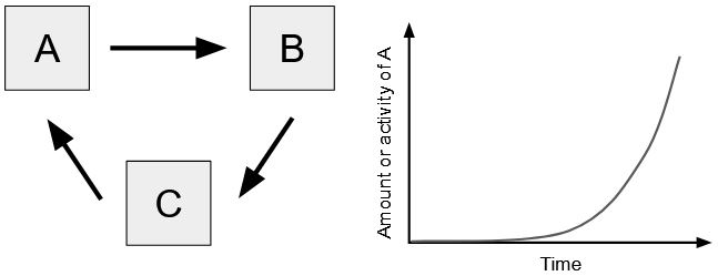
Positive feedback loops push a system to an ever-increasing output until some outside force intervenes. Elements in the system activate each other in a loop such that the system produces an exponentially increasing output. If you trace a loop and it has zero or an even number of negative connectors, it is a positive feedback loop, also known as a reinforcing loop. Examples include action potentials, bioluminescence, and melting of Earth’s polar ice caps.
3. Strategies for Building CLDs
Define Your Nodes
Think of the system you are trying to illustrate or analyze, and write down the nodes that interact with each other. Nodes could be proteins, small molecules, organisms, cells, or any biological object that can be quantified and changes over time.
Draw the Connectors
Take one of the nodes “B” as a starting point and consider what other node “A” causes it to increase or decrease. Then consider the relationship, as A increases B increases also, or does an increase in A cause a decrease in B? Draw the connection from A to B with an arrow or T-bar.
You can also work forwards, taking node “A” as a starting point and considering another node “B” that it causes to increase or decrease. Decide which direction is more intuitive for you. The important part is to consider only two nodes at once and ensure you are only drawing direct (not indirect) interactions.
Consider only pairwise causality, only two nodes and their one connector at a time. Only draw connectors between nodes that interact directly with each other. If A causes C to increase, but it only does so through B, make sure not to connect A to C, only A to B and B to C.
Continue repeating these steps until all nodes are included. Consider that some nodes may have an effect on more than one other node, resulting in a branched CLD.
Find and Label Loops
Now that you have mapped the nodes and edges, find and label the causal loops. Start with a node (for instance one of the variables you care about the most) and imagine it increases. Follow the connections and try to get back to where you started.
When you have found a loop, count the number of negative connectors in the loop. If there are zero or an even number, the loop is a reinforcing, positive feedback loop. Otherwise, there are an odd number of negative connectors, and it is a balancing, negative feedback loop.
The Story
The causal loop diagram helps you to craft a deeper understanding of the system. A system with a reinforcing loop shows exponential growth (or decay); a system with a balancing loop tends to produce oscillation or movement toward equilibrium. This story, together with the diagram, can help you to share a deep understanding quickly.
Practice Questions
Figure Descriptions
Figure 19.2.1. The image consists of two diagrams side by side. The left diagram depicts a positive connector, with two squares labeled “A” and “B.” An arrow extends from “A” to “B,” indicating a directional relationship. The right diagram illustrates a negative connector, also with squares labeled “A” and “B.” A line with a perpendicular end extends from “A” to “B,” suggesting a non-directional or inhibitory relationship. Each diagram has a label beneath it; the left one reads “Positive connector” and the right reads “Negative connector.” [Return to Figure 19.2.1]
Figure 19.2.2. The image consists of three rectangles aligned horizontally. Each rectangle contains a single uppercase letter, with the letter “A” in the left rectangle, “B” in the middle rectangle, and “C” in the right rectangle. The rectangles are connected by straight lines. A line extends from the right side of the rectangle containing “A” to the left side of the rectangle containing “B,” and another line extends from the right side of the rectangle containing “B” to the left side of the rectangle containing “C.” The background is plain and white. [Return to Figure 19.2.2]
Figure 19.2.3. The image is split into two main parts. On the left, there are three boxes labeled “A,” “B,” and “C,” arranged in a triangular formation. Arrows indicate a directional flow between the boxes: a rightward arrow pointing from “A” to “B,” a downward arrow from “B” to “C,” and an upward arrow with a perpendicular bar (indicating inhibition or regulation) pointing from “C” back to “A.” On the right side, there is a line graph displaying a curve. The x-axis is labeled “Time,” and the y-axis is labeled “Amount or activity of A.” The graph shows a curve that starts at the origin, rises sharply, and then levels off, illustrating an increase followed by a plateau. [Return to Figure 19.2.3]
Figure 19.2.4. The image contains a diagram on the left and a graph on the right. The diagram features three squares labeled “A,” “B,” and “C.” They are connected by arrows forming a cycle: an arrow points from “A” to “B,” from “B” to “C,” and from “C” back to “A.” On the right side, there is a graph depicting a curve that begins near the origin and rises sharply, indicating increasing values over time. The x-axis is labeled “Time,” and the y-axis is labeled “Amount or activity of A.” [Return to Figure 19.2.4]
Licenses and Attributions
“Causal Loop Diagrams” by Michelle McCully is adapted from “Causal Loop Diagram” by erik van der pluijm for WRKSHP.tools used under CC BY-SA 4.0. “Causal Loop Diagrams” is licensed under under CC BY-SA 4.0.
Media Attributions
- 1C-J-2.1 Figure – connectors © Michelle McCully is licensed under a CC BY-NC (Attribution NonCommercial) license
- 1C-J-2.2 Figure – double negative © Michelle McCully is licensed under a CC BY-NC (Attribution NonCommercial) license
- 1C-J-2.3 Figure – negative feedback loop © Michelle McCully is licensed under a CC BY-NC (Attribution NonCommercial) license
- 1C-J-2.4 Figure – positive feedback loop © Michelle McCully is licensed under a CC BY-NC (Attribution NonCommercial) license
