N4. Beyond the Basic SIR Model
Michelle McCully
Learning Objectives
By the end of this chapter, you will be able to do the following:
- Given the description of a communicable disease, build the stocks and flows diagram for the SIR model
- Given a stocks and flows diagram of an SIR model, write the mathematical representation
- Interpret a graph of the progression of a disease through the sub-populations of an SIR model
Part of the beauty of compartment models is how flexible they are to accommodate many different disease scenarios. Building an SIR model, even a complicated one, follows the same steps and uses the same building blocks as the Basic SIR Model. In this section, we walk through building a stocks and flows diagram and writing the mathematical equations for progression of a disease for several different disease scenarios.
1. Vaccinations
Vaccinations are our most powerful tool against preventing communicable diseases. It often desirable to build them into an SIR model in order to predict the effects of a vaccination campaign. In an SIR model, vaccination moves people from [latex]S[/latex] directly to [latex]R[/latex], bypassing [latex]I[/latex] entirely. There are two ways to model vaccinations, depending on the period of time you are modeling the disease and the time frame of vaccine distribution. Reality is probably closer to a combination of the two, but we will discuss both separately for simplicity.
One-time vaccination campaign
The first model is a one-time vaccination campaign where a portion of the population [latex](p)[/latex] is vaccinated against a disease (or variant of a disease) before the disease strikes the community. In this case, we will model this as an arrow from [latex]S \rightarrow R[/latex], and the flow is [latex]pN[/latex] where [latex]N[/latex] is the total number of people in the population, all of whom would have been in [latex]S[/latex] at [latex]t=0[/latex] had they not been vaccinated. We use a dotted arrow and note that this occurs at the initial time point, [latex]t=0[/latex]. When building the mathematical equations for how the sub-populations change each day, we will not include this flow. However, we will adjust the initial conditions to show the movement of [latex]pN[/latex] people from [latex]S[/latex] to [latex]R[/latex] at [latex]t=0[/latex].
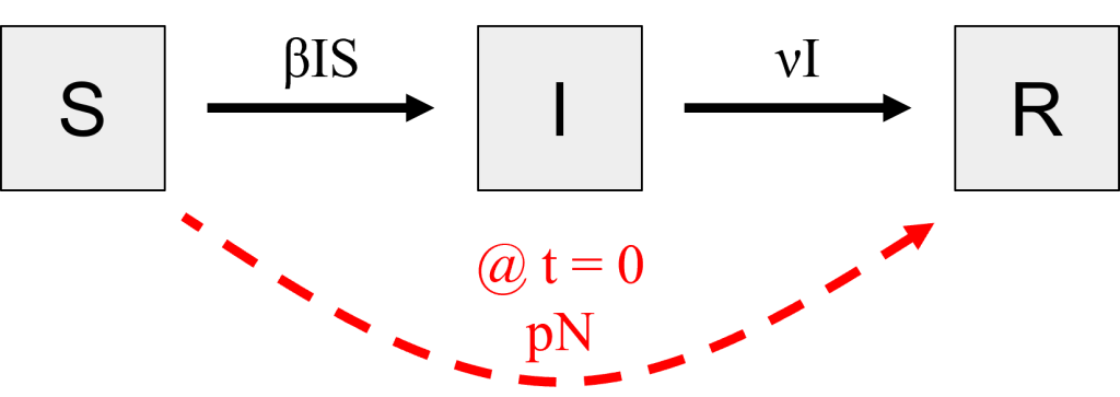
Figure 1: Stocks and flows diagram for a one-time vaccination campaign at t=0. Changes from the Basic SIR Model are highlighted in red. [Image Description]
$$S(t) = S(t-1) - βI(t-1)S(t-1)$$
$$I(t) = I(t-1) + βI(t-1)S(t-1) - νI(t-1)$$
$$R(t) = R(t-1) + νI(t-1)$$
$$S(0) = \textcolor{red}{N - pN}$$
$$I(0) = 1$$
$$R(0) = \textcolor{red}{pN}$$
Ongoing vaccination campaign
When we are modeling a disease that is endemic in a population, we will model vaccinations as an ongoing process. Rather than vaccinating a portion of the population all at once before the disease reaches the community, we will vaccinate some portion [latex]p[/latex] of the population every day. If our goal is to vaccinate 75% of the population over the course of a year, then we would set [latex]p = \frac{0.75}{365\ days}[/latex] per day. This is the proportion of [latex]S[/latex] who would move to [latex]R[/latex] each day, and we would illustrate that as the flow rate over an arrow connecting [latex]S \rightarrow R[/latex].
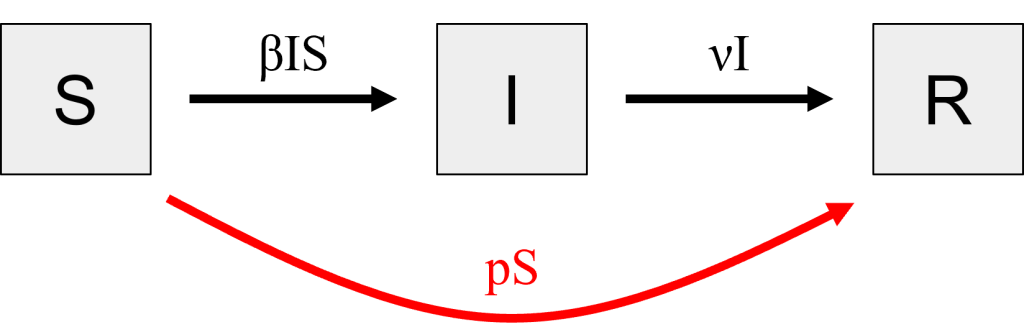
Figure 2: Stocks and flows diagram for an ongoing vaccination campaign. Changes from the Basic SIR Model are highlighted in red. [Image description]
$$S(t) = S(t-1) - βI(t-1)S(t-1) \textcolor{red}{- pS(t-1)}$$
$$I(t) = I(t-1) + βI(t-1)S(t-1) - νI(t-1)$$
$$R(t) = R(t-1) + νI(t-1) \textcolor{red}{+ pS(t-1)}$$
$$S(0) = N$$
$$I(0) = 1$$
$$R(0) = 0$$
Practice Questions
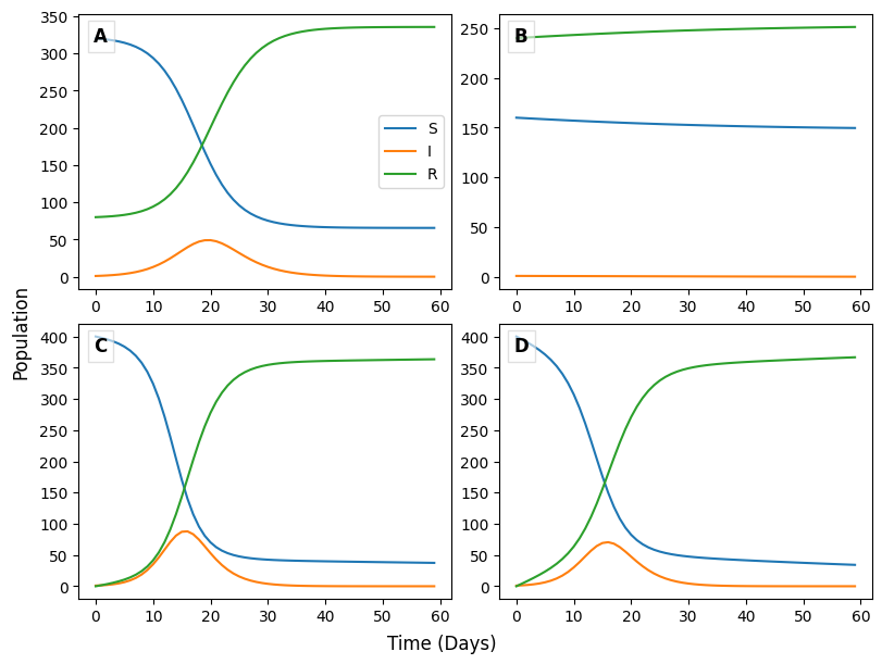
The figure above shows four SIR models that account for vaccinations. Two models model a one-time vaccine campaign and the other two model an ongoing vaccination campaign. The proportion of the population that was vaccinated, p, was set to to 20 or 60%, and the total population size, N, is 400 people. Use these graphs to answer the following questions.
2. Births and deaths in a population
When we build a model to predict the effects of a disease over the course of months-to-years instead of days-to-months, the population changes meaningfully due to the addition of new individuals via births and the removal of individuals due to deaths. There are two types of deaths we may choose to model; the first is deaths due to natural causes, meaning anything but the disease, and the second is deaths due to disease.
Deaths due to disease may be calculated based on the mortality rate (μ), which is defined as the fraction of people infected with the disease who go on to die from it. This mortality rate is the probability of succumbing to the disease over the entire time the person is infected, but for our model we need the mortality rate per day. Therefore, we will calculate [latex]m=\frac{μ}{L}[/latex], the probability of an infected person dying each day. The number of people dying each day is modeled in our stocks and flows diagram as an arrow exiting [latex]I[/latex] with the flow [latex]mI[/latex].
Deaths due to natural causes affect all sub-populations equally, or at least we will treat them that way in our model. It is reasonable to believe that someone is equally likely to die due to, say, cancer or a heart attack, whether they are susceptible to, currently infected by, or recovered from a disease. Therefore, we model deaths due to natural causes as three different flows out of [latex]S[/latex], [latex]I[/latex], and [latex]R[/latex] all with an equivalent rate. We use a constant [latex]d[/latex], the probability of dying due to natural causes on any given day, or the proportion of people who die due to natural causes each day. Each of the three flow arrows will then have a rate equation of [latex]d[/latex] multiplied by the sub-population for which it is the outflow. For example, [latex]dS[/latex] people from the Susceptible sub-population die each day.
For the outflows from [latex]I[/latex], we can combine deaths due to natural causes [latex](dI)[/latex] and deaths due to disease [latex](mI)[/latex] into one equation by summing them, [latex](d+m)I[/latex]. We do not include a sub-population to track deaths due to natural causes, as people who die do not have any effects on the populations we have questions about. However, in principle, we could. More commonly, we might want to split out and create a sub-population to track the number of deaths due to disease, since this value is of interest to the public. Doing so is left as an exercise for the reader.
To account for births, we will assume all babies born are susceptible to disease and therefore model births as an inflow to [latex]S[/latex]. People in [latex]S[/latex], [latex]I[/latex], and [latex]R[/latex] are all equally likely to give birth, and the birth rate, [latex]b[/latex] is typically calculated as a fraction of the full population. Therefore, the rate equation on the inflow to [latex]S[/latex] is [latex]b(S+I+R)[/latex].
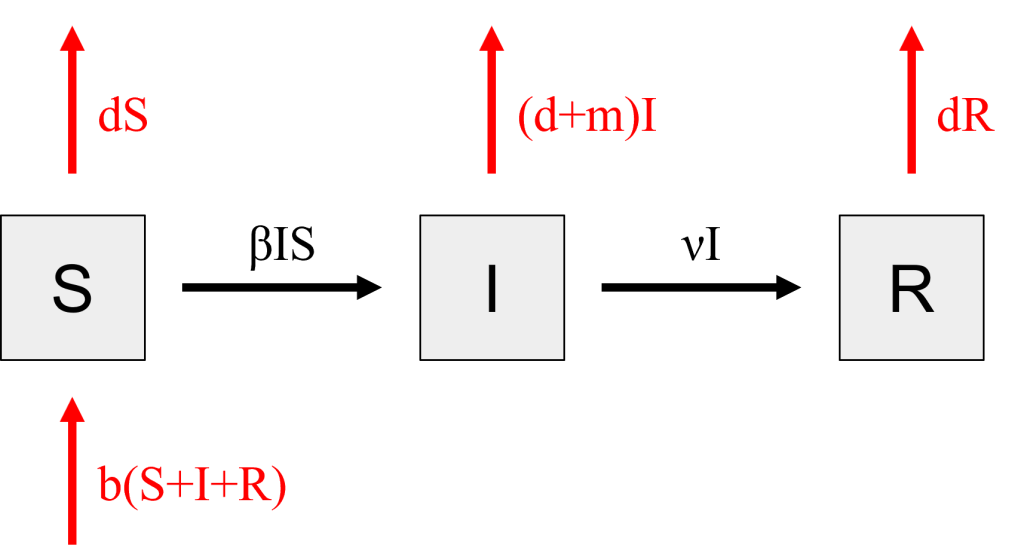
Figure 3: Stocks and flows diagram taking into account births and deaths. Changes from the Basic SIR Model are highlighted in red. [Image Description]
$$S(t) = S(t-1) - βI(t-1)S(t-1) \textcolor{red}{- dS(t-1) + b((S(t-1)+I(t-1)+R(t-1))}$$
$$I(t) = I(t-1) + βI(t-1)S(t-1) - νI(t-1) \textcolor{red}{- (d+m)I(t-1)}$$
$$R(t) = R(t-1) + νI(t-1) \textcolor{red}{- dR(t-1)}$$
$$S(0) = N$$
$$I(0) = 1$$
$$R(0) = 0$$
3. Babies born infected
In the last scenario, we assumed that all babies who were born were susceptible to the disease and (therefore) not infected. Some diseases, such as chlamydia and HIV, can be transmitted from infected mothers to their babies in utero or during birth. In either case, some proportion of new babies would go into [latex]I[/latex] instead of [latex]S[/latex]. To calculate this number, we would need to know the probability, [latex]p[/latex], of an infected mother passing on the disease to her baby, again per day. We will assume only mothers with active infections can give birth to infected babies. Now, only [latex]S[/latex], [latex]R[/latex], and [latex](1-p)I[/latex] people can give birth to susceptible babies, changing the flow rate on the inflow to [latex]S[/latex]. Similarly, [latex]pI[/latex] people give birth to infected babies, adding an inflow to [latex]I[/latex].
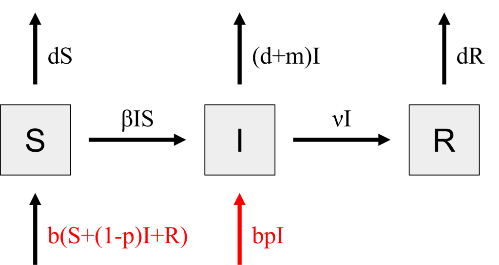
Figure 4: Stocks and flows diagram for babies born infected with a disease. Changes from the SIR Model with births and deaths are highlighted in red. [Image Description]
$$S(t) = S(t-1) - βI(t-1)S(t-1) - dS(t-1) \textcolor{red}{+ b(S(t-1)+(1-p)I(t-1)+R(t-1))}$$
$$I(t) = I(t-1) + βI(t-1)S(t-1) - νI(t-1) - (d+m)I(t-1) \textcolor{red}{+ bpI(t-1)}$$
$$R(t) = R(t-1) + νI(t-1) - dR(t-1)$$
$$S(0) = N$$
$$I(0) = 1$$
$$R(0) = 0$$
Practice Questions
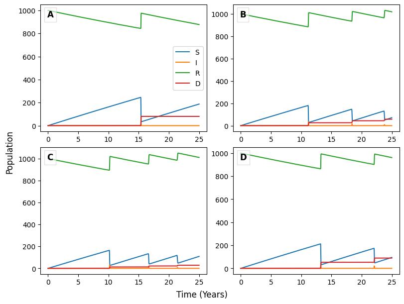
The figure above shows four SIR models that account for births and deaths from natural causes and deaths due to disease, as described in Section 2. The red line labeled "D" quantifies deaths due to disease only. Use these graphs to answer the following questions.
These questions may not render properly in Safari. If you are having issues, please try a different browser.
4. Asymptomatic infectious stage
One of the reasons Covid-19 outbreaks are so difficult to contain is that infected people are initially asymptomatic, and they can transmit the disease to susceptible people during this stage. To model Covid-19, therefore, we add an asymptomatic sub-population to our Basic SIR Model. We will call the Asymptomatic sub-population [latex]A[/latex]. Individuals in the Asymptomatic sub-population have been infected with the virus but are not yet showing symptoms. We will assume here that they can transmit the disease on to Susceptible individuals with the same rate of transmission (β) as an Infected individual. Individuals who are susceptible will move from [latex]S[/latex] to [latex]A[/latex] when they are infected, instead of directly into [latex]I[/latex] as they do in the Basic SIR Model.
The asymptomatic stage for Covid-19 lasts an average of 2 days. We can use that length of time to define a rate constant [latex]a = \frac{1}{2\ days}[/latex], which is the rate people leave [latex]A[/latex] and move onto [latex]I[/latex]. People in [latex]I[/latex] are infectious and are showing symptoms. The flow from [latex]A[/latex] to [latex]I[/latex] is then [latex]aA[/latex]. We will again use [latex]ν[/latex] to represent the recovery rate from [latex]I[/latex] to [latex]R[/latex]. The infection rate describing the flow from [latex]S[/latex] to [latex]A[/latex] will change to [latex]β(A+I)S[/latex] because people from both the [latex]A[/latex] and [latex]I[/latex] sub-populations are able to transmit Covid-19 to a susceptible person.
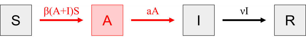
Figure 5: Stocks and flows diagram for Covid-19 that includes an asymptomatic but infectious sub-population. Changes from the Basic SIR Model are highlighted in red. [Image Description]
We can convert the stocks and flows diagram into mathematical notation in the same way we did the Basic SIR Model, but we will need an additional sub-population equation for [latex]A[/latex].
$$S(t) = S(t-1) \textcolor{red}{- β(I(t-1)+A(t-1))S(t-1)}$$
$$\textcolor{red}{A(t) = A(t-1) + β(I(t-1)+A(t-1))S(t-1) - aA(t-1)}$$
$$I(t) = I(t-1) \textcolor{red}{+ aA(t-1)} - νI(t-1)$$
$$R(t) = R(t-1) + νI(t-1)$$
Like for the Basic SIR Model, the initial conditions at [latex]t=0[/latex] are a naive population of [latex]N[/latex] people and add one infectious person.
$$S(0) = N$$
$$\textcolor{red}{A(0) = 0}$$
$$I(0) = 1$$
$$R(0) = 0$$
5. Waning immunity
Another reason Covid-19 outbreaks continue to be a problem across the world is that immunity to the disease wanes quickly, in an average of about 6 months. This means that people can leave the Recovered sub-population and move back to Susceptible with a frequency of [latex]w = \frac{1}{6\ months} = \frac{1}{180\ days}[/latex]. Building on the SAIR model from Figure 1, we can build a new flow from [latex]R[/latex] → [latex]S[/latex] with a waning immunity rate of [latex]wR[/latex].
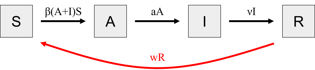
Figure 6: Stocks and flows diagram for Covid-19 that includes an asymptomatic but infectious sub-population and waning immunity. Changes from Figure 1 are highlighted in red. [Image Description]
Both the [latex]S(t)[/latex] and [latex]R(t)[/latex] sub-population growth equations will change to account for the flow of [latex]wR(t-1)[/latex] people from [latex]R[/latex] to [latex]S[/latex] per day.
$$S(t) = S(t-1) - β(I(t-1)+A(t-1))S(t-1) \textcolor{red}{+ wR(t-1)}$$
$$A(t) = A(t-1) + β(I(t-1)+A(t-1))S(t-1) - aA(t-1)$$
$$I(t) = I(t-1) + aA(t-1) - νI(t-1)$$
$$R(t) = R(t-1) + νI(t-1) \textcolor{red}{- wR(t-1)}$$
$$S(0) = N$$
$$A(0) = 0$$
$$I(0) = 1$$
$$R(0) = 0$$
Practice Questions
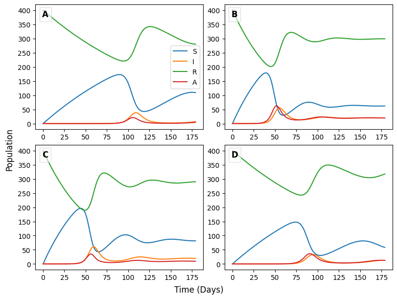
The figure above shows four SIR models that account for an asymptomatic, infectious stage (A) and waning immunity, as described in Sections 4 and 5. They use two different values for [latex]a[/latex] and two different values for [latex]w[/latex]. Use these graphs to answer the following questions.
These questions may not render properly in Safari. If you are having issues, please try a different browser.
6. Vector-borne disease
Vector-born diseases, such as malaria, Zika, Lyme, and Plague, are caused by the infection of a pathogen that is transmitted to humans or other animals via a non-human vector. These pathogens may be viruses, bacteria, or a parasites.
Table 1: Examples of vector-born disease agents and their vectors
| Disease | Vector | Pathogen |
| Malaria | Mosquito | Plasmodium (parasite) |
| West Nile | Mosquito | West Nile virus |
| Zika | Mosquito | Zika virus |
| Lyme disease | Tick | Borrelia burgdorferi (bacteria) |
| Plague | Flea | Yersinia pestis (bacteria) |
For many of these diseases, including malaria, an infected human may not transmit the pathogen to a susceptible human directly. The infected human must first transmit the pathogen to a susceptible vector, and the now-infected vector may then pass it onto a susceptible human.
To build an SIR model of malaria, we will need to add two new sub-populations to account for the mosquitoes. We will have a new stock representing the sub-population of vectors who are susceptible to the Plasmodium parasite [latex](S_v)[/latex] and another for those that are currently infected [latex](I_v)[/latex]. We will assume that, given the relatively short lifespan of a mosquito, it will never recover after being infected, so we will not create a Recovered vector stock. Our three human sub-populations remain the same, though we will give them “h” subscripts for clarity, [latex]S_h[/latex], [latex]I_h[/latex], and [latex]R_h[/latex].
Now, we must consider what needs to happen for a susceptible human [latex](S_h)[/latex] to become infected and move to the infected sub-population [latex](I_h)[/latex]. For a human to become infected, they must come into contact with an infected mosquito [latex](I_v)[/latex]. Again, there will be a transmission rate, β that quantifies 1) how likely an infected mosquito and susceptible human are to come into contact and 2) how likely transmission is to occur given contact. The rate on the flow arrow is therefore [latex]βI_vS_h[/latex]. It is not possible for a human to transmit malaria directly to another human, so [latex]I_h[/latex] is not part of this rate equation. As in the Basic SIR Model, recovery from infection will take a certain amount of time, represented by the recovery rate, [latex]ν[/latex].
For a mosquito to become infected, it must come into contact with an infected human. We will allow the rate of transmission from humans to mosquitoes to be different than that from mosquitoes to humans. Therefore, the transmission rate from an infected human [latex](I_h)[/latex] to a susceptible mosquito [latex](S_v)[/latex] is a new variable, [latex]α[/latex]. The rate equation on the [latex]S_v \rightarrow I_v[/latex] flow is [latex]αI_hS_v[/latex].
Note that there are no arrows between any of the the mosquito and human sub-populations. It may be tempting to draw these arrows, as the parasite itself moves between humans and mosquitoes. However, the flow arrows represent movement of individuals between sub-populations. An arrow from [latex]I_v[/latex] to [latex]S_h[/latex], for example, would represent a mosquito turning into a human!
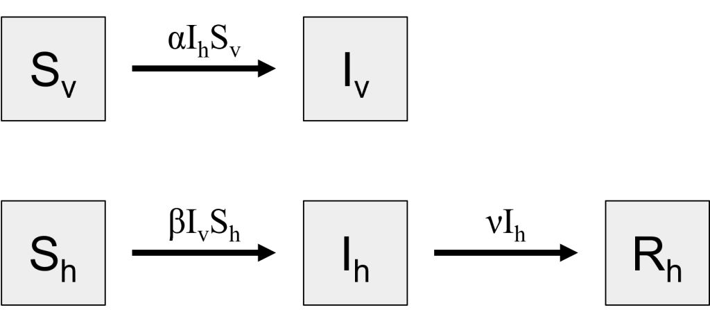
Figure 7: Stocks and flows diagram malaria, a vector-borne disease. [Image Description]
$$S_h(t) = S_h(t-1) - βI_v(t-1)S_h(t-1)$$
$$I_h(t) = I_h(t-1) + βI_v(t-1)S_h(t-1) - νI_h(t-1)$$
$$R_h(t) = R_h(t-1) + νI_h(t-1)$$
$$S_v(t) = S_v(t-1) - αI_h(t-1)S_v(t-1)$$
$$I_v(t) = I_v(t-1) + αI_h(t-1)S_v(t-1)$$
Here we write our initial conditions assuming we start with an infected mosquito, but we could start with an infected human instead.
$$S_h(0) = N_h$$
$$I_h(0) = 0$$
$$R_h(0) = 0$$
$$S_v(0) = N_v$$
$$I_v(0) = 1$$
Practice Questions
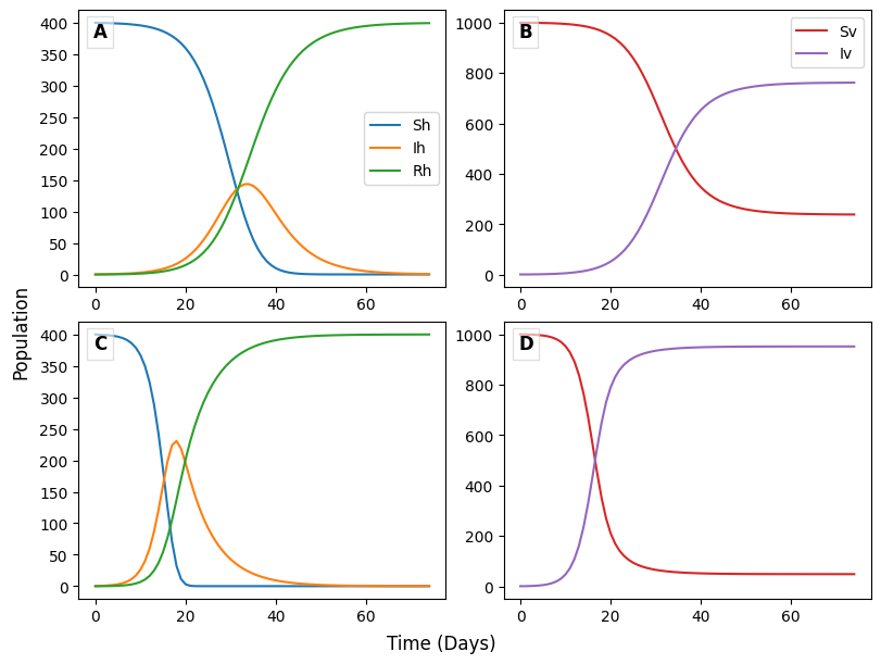
The figure above shows two SIR models for malaria, which is a vector-borne disease, as described in Section 6. The two models use different values for [latex]α[/latex] and [latex]β[/latex]. Panels A and B are the graphs produced by one model, and Panels B and C are the graphs from the other. Use these graphs to answer the following questions.
Image Descriptions
Figure 1: The image displays a diagram with three gray squares, each containing one of the letters "S," "I," and "R," arranged horizontally across the center. The square labeled "S" is on the left, "I" is in the middle, and "R" is on the right. Below the "S" and "I" squares, a red dashed curved arrow points from "S" to "I." Near the arrow, there is red text that reads “@ t = 0 pN.”
Figure 2: The image shows a simple block diagram with three large, gray squares arranged horizontally in a row. Each square contains a single letter, with "S" in the left square, "I" in the middle, and "R" in the right square. A large red curved arrow starts from the bottom of the "S" square, arcs downward, and points to the bottom of the "R" square, with the label "pS" placed along the arrow's path.
Figure 3: The image shows a flow diagram representing a compartmental model in epidemiology. There are three large squares arranged horizontally, each labeled with a single letter: "S", "I", and "R". These represent the compartments Susceptible, Infected, and Recovered, respectively. Arrows connecting these squares indicate the flow between compartments. A black arrow labeled "βIS" points from "S" to "I", and another black arrow labeled "νI" points from "I" to "R". Red arrows are directed upwards above each compartment, labeled "dS" above "S", "(d+m)I" above "I", and "dR" above "R". Another red arrow labeled "b(S+I+R)" points upwards from below "S". The squares are light gray with thin black outlines.
Figure 4: The image is a flow diagram depicting a compartmental model often used in epidemiology. It consists of three rectangular compartments labeled "S", "I", and "R", representing different population groups. The compartments are connected by arrows, which illustrate the transitions between these groups. The compartment labeled "S" is on the left, "I" in the middle, and "R" on the right. An arrow labeled "βIS" points from "S" to "I", indicating the rate of infection. Another arrow labeled "vI" points from "I" to "R", showing the recovery rate. Vertical arrows from the top of each compartment point upwards, labeled "dS", "(d+m)I", and "dR" respectively, indicating the natural death or removal rates for each group. Additionally, two red arrows are present: one from below "S" labeled "b(S+(1-p)I+R)" and another from below "I" labeled "bpI", signifying birth and other transition dynamics.
Figure 5: The image is a schematic diagram featuring four rectangles with letters inside, connected by arrows. The rectangles are horizontally aligned against a black background. From left to right, the rectangles contain the letters "S," "A," "I," and "R." Each rectangle is labeled with a single, bold black letter situated in the center. A red arrow with a label in red text "β(A+I)S" points from "S" to "A," both of which have light gray backgrounds. Another red arrow labeled "aA" leads from "A," which is highlighted in light red, to "I," which is colored light gray. The lettering and arrows stand out against the diagram, creating a clear flow from left to right. [Return to Figure]
Figure 6: The image features a diagram with four gray squares evenly spaced in a horizontal line. From left to right, each square contains a single black letter: "S," "A," "I," and "R." Below these squares, a curved red arrow connects the first square (with the letter "S") back to the fourth square (with the letter "R"). The arrow forms a wide arc from the leftmost to the rightmost square. Below the arc, the text "wR" is displayed in red, centered beneath the curve.
Figure 7: The image depicts a flow diagram with four gray rectangles connected by arrows, representing different compartments and transitions in a compartmental model. The top left rectangle labeled "S_v" represents susceptible vectors. An arrow pointing right labeled "α I_h S_v" connects it to the top right rectangle labeled "I_v," indicating infected vectors. The bottom left rectangle labeled "S_h" represents susceptible hosts. Two arrows emerge from it: one labeled "β I_v S_h" pointing right to the bottom middle rectangle labeled "I_h," indicating infected hosts, and another labeled "ν I_h" pointing right to the bottom right rectangle labeled "R_h," representing recovered hosts.
Licenses and Attributions
“Beyond the Basic SIR Model” by Michelle McCully is licensed under CC BY-NC 4.0.
Media Attributions
- 1C-N-4.1 Figure – one-time vax s+f © Michelle McCully is licensed under a CC BY-NC (Attribution NonCommercial) license
- 1C-N-4.1 Figure – ongoing vax s+f © Michelle McCully is licensed under a CC BY-NC (Attribution NonCommercial) license
- 1C-N-4.1 Quiz image – vaccinations © Michelle McCully is licensed under a CC BY-NC (Attribution NonCommercial) license
- 1C-N-4.2 Figure – births + deaths © Michelle McCully is licensed under a CC BY-NC (Attribution NonCommercial) license
- 1C-N-4.3 Figure – infected babies © Michelle McCully is licensed under a CC BY-NC (Attribution NonCommercial) license
- 1C-N-4.3 Quiz image – births + deaths © Michelle McCully is licensed under a CC BY-NC (Attribution NonCommercial) license
- 1C-N-4.4-Figure-SAIR-sf © Michelle McCully is licensed under a CC BY-NC (Attribution NonCommercial) license
- 1C-N-4.5-Figure-waning-immunity-sf © Michelle McCully is licensed under a CC BY-NC (Attribution NonCommercial) license
- 1C-N-4.5 Quiz image – SAIR + waning immunity © Michelle McCully is licensed under a CC BY-NC (Attribution NonCommercial) license
- 1C-N-4.6 Figure – vector-borne © Michelle McCully is licensed under a CC BY-NC (Attribution NonCommercial) license
- 1C-N-4.6 Quiz image – vector-borne © Michelle McCully is licensed under a CC BY-NC (Attribution NonCommercial) license
