N2. SIR Models to Describe Disease Progression
Michelle McCully
Learning Objectives
By the end of this chapter, you will be able to do the following:
- Describe connections between elements in a system using words, equations, and graphs and convert between them.
- Convert between a stocks and flows diagram and mathematical notation.
In the previous chapter, we defined three sub-populations, Susceptible [latex](S)[/latex], Infected [latex](I)[/latex], and Recovered [latex](R)[/latex], and two constants, transmission rate [latex](β)[/latex] and recovery rate [latex](ν)[/latex]. Ultimately, our goal is to build a series of mathematical equations that describe how individuals move between these three sub-populations and use a computer to graph the number of people in each sub-population over time. These graphs contain information useful to epidemiologists and public health scientists about, for example, how long we might expect a disease outbreak to last or how many people we predict will get sick. The first step in this process is building a stocks and flows diagram.
1. Stocks and flows diagrams
Forrester developed the discipline of system dynamics, wherein all models are expressed in terms of quantities known as stocks (levels) and flows (rates).[1] The creation of stocks and flows diagrams is analytically identical to writing the equivalent set of equations and facilitates the modeling of complex, non-linear systems in an accessible manner – that is, without using mathematical notations (yet).
Consider the simple example of water accumulating in a bathtub. The accumulated quantity, known as the stock, is the water in the tub. This stock results from the inflows and outflows representing the rates of change of the stock known as flows. Other examples of stocks include the inventory of vaccines in a rural clinic or the number of infected individuals during an epidemic.
The accumulation or loss of one of the stock quantities is known as a flow. In the vaccine example, the flows would be the rates of vaccine delivery and usage, respectively. In the case of infected individuals, the flows represent the rates of infections and recovery. In each case, the stock is the accumulation of the difference between the inflow and outflow rates.
Figure 1 shows the stocks and flows diagram of the vaccines example. It has flows labeled delivery rate, [latex]k_{delivery}[/latex] and usage rate [latex]k_{usage}[/latex] of vaccine represented by arrows indicating the direction of the flow. The accumulating or diminishing stock of vaccines is represented by the rectangular box labeled, [latex]V[/latex].
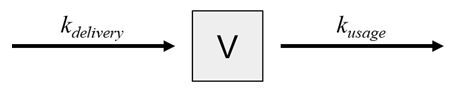
Figure 1: Stocks and flows diagram showing the model of a vaccine (stock) being replenished through the deliveries and depleted through usage (flows). [Image Description]
Stocks and flows diagram of the SIR model
The first step in building a stocks and flows diagram is to define your stocks. The SIR model comprises three compartments or sub-populations, [latex]S[/latex], [latex]I[/latex], and [latex]R[/latex], and each is represented by a stock as shown in Figure 2.
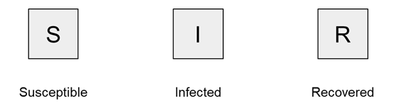
Figure 2: Stocks in an SIR compartment model representing the susceptible, infected, and recovered populations. [Image Description]
The second step is defining the flows. In an SIR model, the flows are the movement of people through the different sub-populations. People who are susceptible can become infected, and people who are infected can recover, as shown in Figure 3. Note that the direction of the arrow is important, as it shows which population is decreasing and which is increasing due to the defined flow. Combinatorially, there are four more flows we could draw on this diagram, but they do not reflect the dynamics of disease progression in our model, so we will not draw these arrows. Susceptible people cannot move directly to Recovered without being infected [latex](S \nrightarrow R)[/latex], people who have recovered cannot become susceptible or infected again [latex](R \nrightarrow S, R \nrightarrow I)[/latex], and recovery from infection confers immunity [latex](I \nrightarrow S)[/latex]. Similar to building causal loop diagrams, we only draw flow arrows representing direct connections.
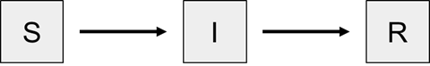
Figure 3: Flows in an SIR compartment model representing susceptible people becoming infected and infected people recovering. [Image Description]
The final step in building a stocks and flows diagram is to define the rate equations on each flow arrow. We begin by examining how the stock [latex]S[/latex] changes. [latex]S[/latex] has zero inflow rate and becomes depleted as people become infected and convert to [latex]I[/latex]. The flow out of [latex]S[/latex], and into [latex]I[/latex] is the infection rate, which is known to be equal to the product of a constant [latex](β)[/latex], the population of infected individuals [latex](I)[/latex], and [latex]S[/latex]. Stated succinctly, [latex]infection\ rate = βIS[/latex].
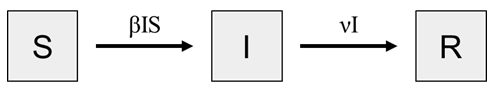
Figure 4: Stocks and flows diagram for the SIR compartment model. [Image Description]
The stock [latex]I[/latex] increases as people become infected and decreases as people recover. The inflow of [latex]I[/latex] is the infection rate, and we will call the outflow the recovery rate. The recovery rate is equal to the product of the constant [latex]ν[/latex], and variable [latex]I[/latex], i.e., [latex]recovery\ rate = νI[/latex]. The transmission rate depends on both [latex]S[/latex] and [latex]I[/latex] because both a susceptible and infected individual must come into contact for transmission to occur. However, the recovery rate depends only on [latex]I[/latex] because the recovery rate depends on the length of time an infected person is sick. An infected person does not need to come into contact with – or otherwise depend on – a recovered person (or a susceptible one, for that matter) to recover.
Practice Questions
2. Describing stocks and flows diagrams using mathematical equations
Given a stocks and flows diagram and equations for each of the flows, we can describe the number of items in any stock mathematically and plot the value over time. We will interpret the equations on each flow arrow as the number of items that move between the connected stocks in a discrete time period. For simplicity sake, let’s make this time period one day.
Going back to the vaccine delivery system (Figure 1), we can describe how many vaccines [latex](V)[/latex] are in storage on day [latex]t[/latex] as [latex]V(t)[/latex], read as “V of t.” If we wanted to write the number of vaccines in storage on day 2, we would write [latex]V(2)[/latex]. As we talk through the logic of building these equations, we will describe day [latex]t[/latex] as “today,” which makes day [latex]t-1[/latex] “yesterday.” If [latex]V(2)[/latex] is the number of vaccines in storage today, then [latex]V(1)[/latex] was the number of vaccines in storage yesterday.
To calculate the number of vaccines in storage at the beginning of today [latex]V(t)[/latex], we need to know three things: 1) the number of vaccines in storage at the beginning of yesterday [latex]V(t-1)[/latex], 2) the number of vaccines delivered yesterday [latex](k_{delivery})[/latex], and 3) the number of vaccines used yesterday [latex](k_{usage})[/latex]. The number of vaccines that we have in storage today [latex]V(t)[/latex] is equal to the number of vaccines in storage yesterday [latex]V(t-1)[/latex] plus the number of vaccines delivered [latex]k_{delivery}[/latex] minus the number of vaccines used [latex]k_{usage}[/latex]. We can write this mathematically as:
$$V(t) = V(t-1) + k_{delivery} - k_{usage}$$
Once you have a stocks and flows diagram with equations on the arrows, it is straightforward to translate it into mathematical equations following these same steps. The number of items in each stock at the current time point is equal to the number at the previous time point plus the equations on any arrows pointing to the stock and minus the equations on any arrows pointing away from the stock.
Mathematical description of the SIR model
Now we will build the population growth equations for our SIR model (Figure 3). As the inflow to [latex]S[/latex] is zero and thus infection rate is the only flow affecting [latex]S[/latex], we conclude that the rate of change of [latex]S = -βIS[/latex]. In words, we would say that the number of susceptible people today is equal to the number of susceptible people yesterday minus the ones who got infected. In mathematical terms,
$$S(t) = S(t-1) - βI(t-1)S(t-1)$$
We write the infection rate, [latex]βIS[/latex], as [latex]βI(t-1)S(t-1)[/latex] when we are writing the population growth equations. The transmission rate [latex]β[/latex] is a constant, meaning that it does not depend on the number of people in any of the sub-populations and it does not change with time. [latex]I[/latex] and [latex]S[/latex] are both variables that change with time – they are the number of people in the infected and susceptible sub-populations at each time point modeled. Therefore, we need to specify the time point for which we want to use the value. Specifically, we want to calculate the number of people infected yesterday, so we will use the number of people in the infected and susceptible sub-populations yesterday, [latex]I(t-1)[/latex] and [latex]S(t-1)[/latex].
For the infected stock [latex]I[/latex], the rate at which [latex]I[/latex] changes is the difference between the inflow to [latex]I[/latex], which is the infection rate [latex]βIS[/latex], and the outflow from [latex]I[/latex], the recovery rate [latex]νI[/latex]. Stated in words, the number of infected people today is equal to the number of infected people yesterday plus the people who got infected yesterday minus the people who recovered yesterday. Stated mathematically:
$$I(t) = I(t-1) + βI(t-1)S(t-1) - νI(t-1)$$
Finally, we examine what brings about the rate of change of the stock of recovered people, [latex]R[/latex]. As there is no outflow from [latex]R[/latex] in this model, the number of people in the [latex]R[/latex] sub-populatoin today must simply depend on the number of recovered people yesterday and the recovery rate, [latex]νI[/latex]. Mathematically, this is:
$$R(t) = R(t-1) + νI(t-1)$$
Thus, Figure 4 is a direct illustration of these three mathematical equations. From the diagram of the the three stocks, [latex]S[/latex], [latex]I[/latex], and [latex]R[/latex], with their accompanying in and out flow rates alone, one can write out the mathematical sub-population growth equations. Once populated with numerical values, including the initial values for the stocks, the model may be simulated to predict the progression of the disease through the population.
Initial values for the SIR sub-populations
We can calculate the number of people in any sub-population if we know the values of the rate constants and the number of people in the sub-population on the previous day. This becomes a problem when we want to know how many people are in the sub-population initially, when [latex]t = 0[/latex]. When building models, the modeler must choose the initial values for each sub-population. In our Basic SIR Model, we are assuming that everyone in the population [latex](N)[/latex] is susceptible and that one infected person enters the population. Therefore, initially,
$$S(0) = N$$
$$I(0) = 1$$
$$R(0) = 0$$
Practice Questions
Image Descriptions
Figure 1: The image shows a simple diagram consisting of a central square with a "V" inscribed inside it. This square is flanked by two arrows. The arrow on the left points towards the square and is labeled "k_delivery," while the arrow on the right points away from the square and is labeled "k_usage." The background is plain white, and the elements are depicted in black. [Return to Figure]
Figure 2: The image features three square icons arranged horizontally against a plain background. Each square has a large, bold letter centered in it. From left to right, the letters are "S," "I," and "R." Below each square, corresponding labels are present: "Susceptible" under "S," "Infected" under "I," and "Recovered" under "R." The squares have a simple black border, and the letters and labels use a straightforward, sans-serif font. [Return to Figure]
Figure 3: The image features a linear flow chart with three labeled boxes connected by arrows. On the far left, there is a square with the letter "S" inside. An arrow points right from the "S" to another square labeled "I" in the center. A second arrow continues right from "I" to a square labeled "R" on the far right. The background is plain white, and the elements are simple and monochromatic. [Return to Figure]
Figure 4: The image displays a diagram depicting a three-stage process with three rectangles in a linear sequence. Each rectangle contains a single capital letter: "S," "I," and "R." The rectangle labeled "S" is on the left, "I" is in the center, and "R" is on the right. Arrows connect the rectangles, indicating a progression from "S" to "I" to "R." Above the first arrow, there is text "βIS," and above the second arrow is the text "νI." The background of each rectangle is a light gray, and the text is in black. [Return to Figure]
Licenses and Attributions
“SIR models to describe disease progression” by Michelle McCully is adapted from “Facilitating Understanding, Modeling and Simulation of Infectious Disease Epidemics in the Age of COVID-19” in Frontiers in Public Health 9:593417, 2021 by David M Rubin, Shamin Achari, Craig S. Carlson, Robyn F.R. Letts, Adam Pantanowitz, Michiel Postema, Xriz L. Richards, and Brian Wigdorowit used under CC BY 4.0. “SIR models to describe disease progression” is licensed under CC BY-NC 4.0.
Media Attributions
- 1C-N-2.1 Figure – vaccine s+f © Michelle McCully is licensed under a CC BY-NC (Attribution NonCommercial) license
- 1C-N-2.1-Figure-S-I-R-stocks © Michelle McCully is licensed under a CC BY-NC (Attribution NonCommercial) license
- 1C-N-2.1 Figure – S I R flows © Michelle McCully is licensed under a CC BY-NC (Attribution NonCommercial) license
- 1C-N-2.1 Figure – S I R equations © Michelle McCully is licensed under a CC BY-NC (Attribution NonCommercial) license
- Ford A. Modeling the environment. Washington, DC: Island press; 2010. ↵
