18 Rhetorical Analysis of Visual Texts
Overview
This chapter covers how to identify and evaluate visual rhetoric. “Visual rhetoric” includes many different genres and modalities (like photographs, memes, graphs, and videos), and can be transmitted via multiple platforms (like television, streaming services, and social media platforms). These forms of media might be relatively new, but people have been creating and consuming images for millennia, as we discuss below. An important part of human development, and your development as a communicator, consists of making images, enjoying them, and discussing them. Overall, this chapter provides a basis for analyzing visual rhetoric and how to apply it in various situations.
Learning Outcomes
By the end of this chapter, you’ll be able to:
- Define visual rhetoric and explain how images function as rhetorical texts with purpose, audience, and context
- Analyze how design decisions like balance, repetition, and spacing can influence a viewer’s understanding and response to an image
- Interpret visual texts using rhetorical appeals and other frameworks that evaluate cultural, historical, and social significance
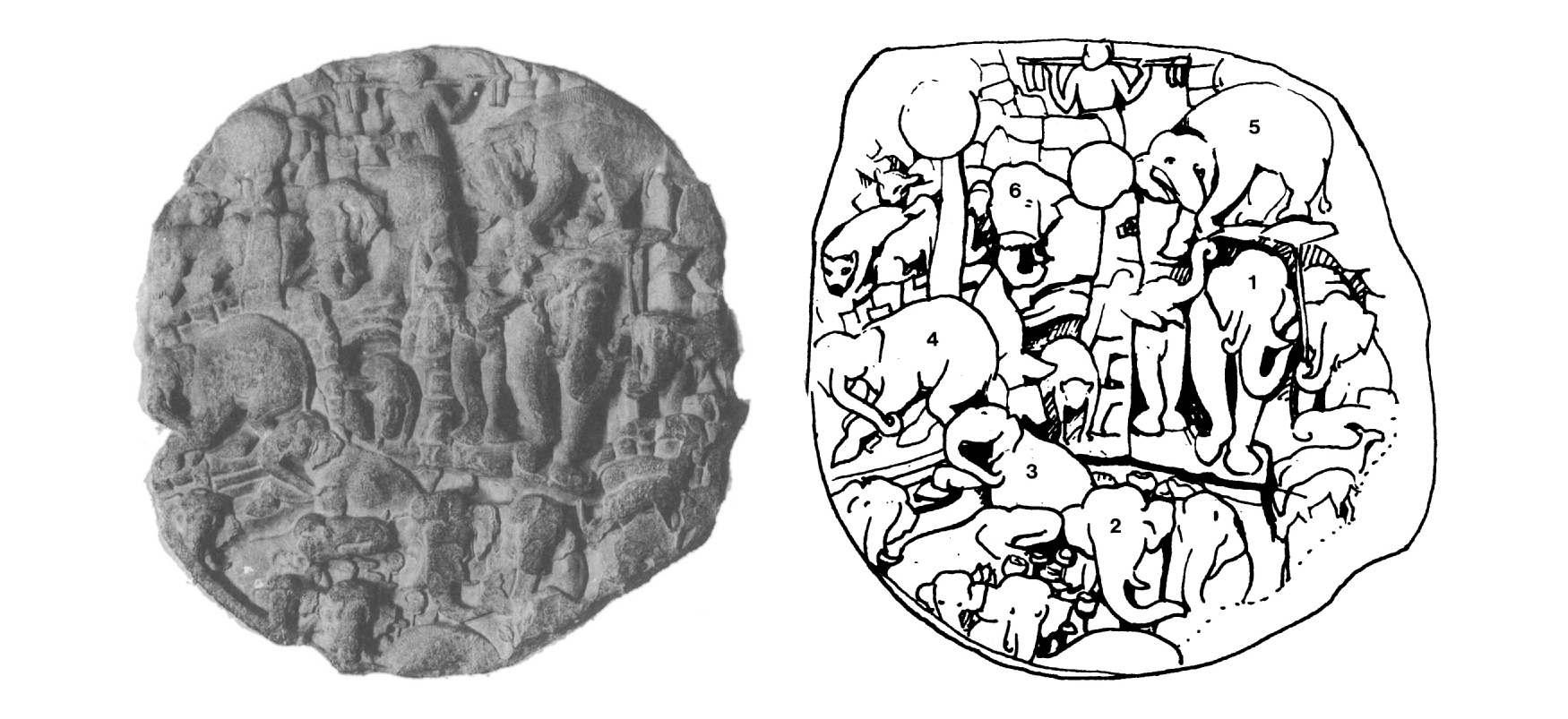 Figure 18.1. Amaravati medallion with annotated key. [Image Description]
In the image above (Fig 18.1), you’ll see a carved medallion, found at Amaravati in a Buddhist shrine that dates from the later BCE to early CE period. On the right, the individual images in the carving are outlined and numbered, explaining the narrative sequence and showing the audience how to “read” the medallion. Together, the two serve as an early example of visual rhetoric.
Formerly, visual texts were created exclusively by painters, photographers, and others generally designated as artists. Today, given the proliferation of technologies that enable the easy capture and manipulation of images, such visual texts are created by a multitude of authors. In this chapter, terms for these image creators — artist, author, composer, and creator — are used interchangeably.
This chapter examines the elements of visual literacy and analysis most likely to complement the textual literacy emphasized in first-year rhetoric classes. A critical understanding of visual texts is key to helping you both as a consumer of the frequent images you encounter in reading and viewing, and as a producer who incorporates images into your own writing.
Interpreting Visual Information
Both words and pictures convey information, but each does so in different ways that require interpretation. Interpretation is the sense a person makes of a piece of communication — textual, oral, or visual. It includes personal experience, the context in which the communication is made, and other rhetorical elements. By the time readers get to college, they have internalized strategies to help them critically understand a variety of written texts.
Images present a different set of challenges for critical readers. For example, in a photograph or drawing, information is presented simultaneously, so viewers can start or stop anywhere they like. Because visual information is presented this way, its general meaning may be apparent, while more nuanced or complicated meanings may take longer to figure out and are likely to vary from one viewer to another.
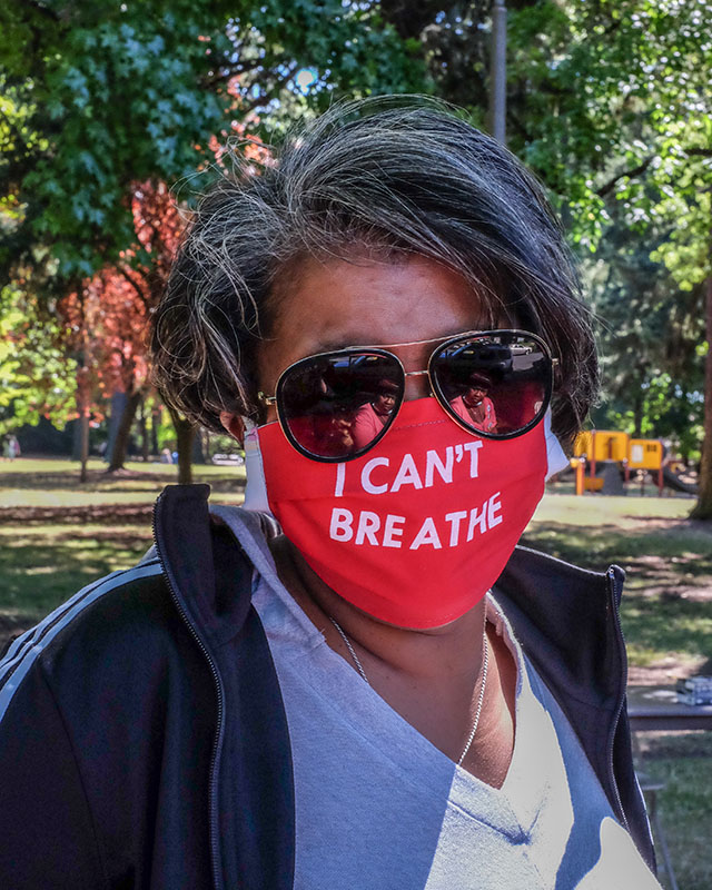
The picture above (Fig 18.2) depicts more than just a moment in time for the sake of memory, although it certainly does that, too. It portrays a central, dominant figure. The color red is bold and centers the figure, giving the image weight. It also conveys several political messages, both obvious and nuanced. The person in the picture is wearing a mask, as people were either asked or mandated to do during the COVID-19 pandemic. The slogan on their mask reads, “I can’t breathe,” words that were made infamous after Eric Garner (1970–2014) died as the result of an illegal chokehold inflicted by New York City police officer Daniel Pantaleo during arrest. These words were repeated by George Floyd (1973–2020) in an 8-minute, 46-second video showing his murder by Minnesota police officer Derek Michael Chauvin, who knelt on Floyd’s neck. The phrase became one of several slogans of the Black Lives Matter (BLM) movement, symbolizing the struggle that People of Color endure when living in an implicitly and explicitly racist culture. Breathing — like blood — is fundamental, essential. Without breath, there is no life. Thus, this slogan draws attention to the fact that People of Color may be brutalized for no reason other than their existence.
Placing the slogan on a mask is a design choice likely to provoke those who have argued against mandated mask wearing as an assault on personal liberty, and who have proclaimed that they could not breathe while wearing masks. Juxtaposition, or placing contrasting elements close together, is a technique that image creators often use for a variety of purposes: humor, irony, sarcasm, or — in this case — disgust or outrage. The juxtaposition of the mask with a slogan referencing literal asphyxiation emphasizes the wearer’s view that state violence against People of Color is a more serious threat to their existence than a mask. Thus, the image is open to multiple interpretations.
Thinking Critically
To think critically about visual information, first identify the objects, facts, processes, or symbols portrayed in the image above.
Now that you understand the context behind the image above, ask yourself the following questions:
- Is there a main or unifying idea?
- Is the meaning open to multiple interpretations?
- Is the meaning suggested but not stated?
- Is the meaning clear and unambiguous?
- Are there multiple levels of meaning, both stated and unstated?
When you view an image, pausing to answer such questions will sharpen your ability to think critically, increase your understanding of the visual information you encounter, and help you use images more meaningfully in texts you create.
Visual Rhetoric
Written texts rely on strategies such as thesis statements, topic sentences, paragraphing, tone, and sentence structure to communicate their message to their audience. Images rely on different strategies, including point of view, arrangement, color, and symbol. When writing about images or including them in your writing, think critically about visual strategies and the effect they will have on your audience.
Using these techniques may or may not make you a proficient artist or creator of images. However, familiarity with the technical language of the visual arts will certainly enable you to describe what you observe as you build your ability to interpret, analyze, and make persuasive arguments about images.
Analyzing Images
 When describing an image, you might state that a line is blue. When you analyze an image, you might discuss what the symbolic function of that color or line is. In short, analysis begins with a description, but it does not end there. The elements of visual rhetoric need to be both described and analyzed to discover the artist’s intentions.
When you analyze an image, you contribute to an ongoing global discussion, helping create the kaleidoscope that makes such rhetorical discussions meaningful. Don’t worry about whether your contribution is right or wrong. Instead, consider its value to the global discussion. What can you say that would broaden understanding of the visual text and your experience of the world? This task may seem overwhelming, especially when you consider the work of a well-known artist. However, your experiences and opinions are still unique and valuable.
So far, this task sounds a lot like reflection, with one difference: reflection focuses on personal responses, reactions, feelings, and experiences, whereas analysis broadens that discussion to include the effects of various technical elements on a variety of people in different contexts.
When analyzing an image, consider some of the following questions:
- Why did the creator select these technical elements?
- How are various audiences likely to react to them?
- How have interpretations of the image changed over time, and how are they likely to change in the future?
- What effect does the historical or current context have on your interpretation?
The Language of Visual Rhetoric
Images speak to viewers in a language that short-circuits their critical thought processes and goes directly to their sensory receptors. Yet, unlike a simple, instinctive response to stimuli, the goal of critical thought, reflection, and discourse is to consider how and why viewers respond the way they do to certain images. To do this, viewers should consider the techniques that artists use to elicit such reactions. In this way, artists and viewers create a shared language of visual rhetoric in which both can discuss the strengths and weaknesses of a work of art as well as its historical and artistic contributions.
Key Terms in Visual Rhetoric
- Arrangement: Artists arrange their work to emphasize certain aspects and to create patterns of repetition and variation. “Arrangement” and “composition” are often used synonymously.
- Color and symbol: Images communicate their meaning in part through the variety and interplay among colors. Even the choice to use black and white or a monochrome color palette is a color choice. Symbols in images allude to deeper meanings.
- Composition: Composition is often used as an umbrella term encompassing all aspects of visual rhetoric. It can also be used synonymously with “arrangement” to describe how the piece is put together.
- Juxtaposition: In visual art, juxtaposition is the placement of contrasting images close together to emphasize their connection, lack of connection, or incongruity.
- Light: Light can be used to highlight or obscure various parts of an image. It can also serve to create patterns or prismatic effects.
- Line: In addition to emphasizing shapes, artists use lines to draw the viewer’s eye to certain elements, often in a predetermined order or pattern.
- Multimodality: Multimodality is the use of multiple, distinct forms of communication together to convey a message. For example, the weather app on your phone is multimodal because it presents an alphanumeric description of the weather (e.g., 70 degrees and partly sunny) as well as a visual representation (e.g., an image of a sun peeking out from behind a cloud).
- Point of view: Also called perspective, the point of view encompasses what an image includes, what it excludes, and where its focus lies.
Point of View
In written texts, the point of view refers to the perspective of the person (often the narrator) who shapes how we see the world. However, in photographs, drawings, and paintings, the point of view refers to the place from which the image creator looks at the subject — where the photographer places their camera or where the painter places their easel. This point of view shapes the way we view the image.
Photographs that haven’t been manipulated in a darkroom or digitally by a computer only reproduce the subject in front of the camera, as it exists in the moment the shutter opens and closes. They do not show anything to the left or right, above or below, or what comes before or after. A camera aimed to the east omits information from the north, west, and south. In other words, any photograph is the result of the photographer’s choice of location, angle, time of day, and lens. All these decisions about where, when, and how to place the camera create a specific point of view.
You can find good examples of these kinds of limited truths in real estate advertisements featuring photographs of houses for sale. The photograph might not reveal a landfill next door or a factory across the street — though you might infer such limitations from a low selling price or confirm them by driving past the house.
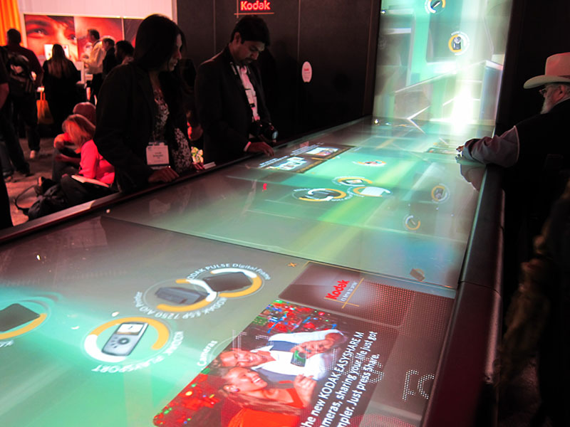 Figure 18.3. Kodak Digital Waterfall. [Image Description]
The creator of the above image (Fig 18.3) chooses to highlight the digital waterfall with its seductive lighting and colors. Meanwhile, the people interacting with the computer are barely visible, standing off to the side, some nearly out of the frame. The silhouetted profiles and darkened faces lack identifying details. These features are emphasized by the blurred people in the background. These figures, too, are unidentifiable and are looking out of the frame, uninterested. The effect is to imply that the waterfall and its computer interface dominate human interaction and possibly even human existence in this context.
To think critically about a point of view, answer the following questions:
- From what place or stance does the image creator view the subject?
- What effect does this particular point of view have on the way viewers may think or feel about the subject?
- What would happen if the vantage point were elsewhere — above or below, left or right?
- What would change in the image if the point of view were changed?
Arrangement
In addition to point of view, artists use arrangement to signal an image’s significance to the reader. This aspect is also referred to as the image’s composition, or how it is put together. The term arrangement in visual texts might be compared to terms such as order, organization, and structure in verbal texts, though the differences are substantial. While writers arrange a story, essay, or poem to take place over time — that is, the time readers need to follow the text, line by line, through a number of pages — image creators arrange pictures in the two-dimensional space of their viewfinder, paper, or canvas to invite viewers to read in space rather than time.
This difference is also evident in sculpture and other three-dimensional works, which require viewers to move around them to read them spatially. In visual texts, then, arrangement refers to the ways in which the various parts of a picture come together to present a single coherent experience for the viewer.
In contrast to static images, which are read spatially, videos and some types of multimodal texts — those incorporating more than one genre, discipline, or literacy (for example, GIFs that incorporate pictures or videos with language) — combine elements of both time and space. That is, they invite viewers to examine an image in motion that changes over time. Video creators often mimic linear time by telling a story, or repeat key images to be interpreted differently after being seen in various contexts within the video.
One element to examine is the use of pattern — predictable, repeated elements within the visual field that the eye is naturally drawn to. Just as sonnets, sestinas, and haiku follow patterns of lines, so do visual compositions. But in these, patterns are created by light and color rather than words. Documentary and commercial photographers often use visual patterns to lead viewers to an intended message. Patterns are especially prominent in street art, where the elements of surrounding architecture and infrastructure interact with the work, as shown in the following figure (Fig 18.4).
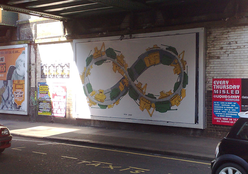 Figure 18.4. Gaza Strip mural in Prague, Czech Republic. [Image Description]
Many patterns are suggested by mathematics. For example, the Möbius strip is both a mathematical construct and a visual enigma. It has one side and one boundary curve. It looks like a spiral, but it does not intersect itself. Thus, it gives the impression of being infinite. In the mural pictured above (Fig 18.4), the artist capitalizes on these features of the Möbius strip, using it to depict the seemingly endless cycle of destruction (green tanks) and reconstruction (yellow steamrollers) in one of the world’s most contested pieces of real estate: the Gaza Strip.
Ownership and control of the Gaza Strip are disputed. Approximately two million people live there, many in refugee camps. Since the mid-20th century, the region has been fought over by Israel, Egypt, and Palestinian Arabs. As you contemplate the mural, think about the way its creator uses pattern and repetition to convey ideas and emotions.
Ask yourself the following questions about the mural above:
- Which elements within the mural are repeated?
- Where is its center of “gravity” or “weight”?
- Where do patterns of light/dark, large/small, and color lead the eye?
- How do pattern and balance contribute to meaning in a two-dimensional image?
- What does the arrangement suggest about the meaning of the image?
Color
Pattern and arrangement are controlled by the image creator and intended to guide the viewer. Color and symbol allow the viewer greater latitude in interpreting the image, in part because particular colors suggest specific moods and can provoke certain emotions or connotations.
Think about your personal reactions to different colors. What color might you select to paint your bedroom? What is your favorite color for, say, clothing or cars? While these may differ according to personal preference, traditional symbolic values are attached to different colors in literature and art. Why, for instance, does red often symbolize anger or war on the one hand and romance or passion on the other? Why does black often suggest danger or death? And why does white often stand for innocence or purity? Are the reasons for these associations arbitrary, cultural, or logical?
Particular colors also suggest or reinforce social and political ideas. What, for example, is suggested by adding a red, white, and blue American flag to a magazine advertisement for an American automobile, political poster, or bumper sticker? What is the meaning of a yellow ribbon tied to a tree in front of a house or an image of a yellow ribbon sticker attached to the tailgate of a pickup truck? By themselves, colors do not specify political positions, arguments, or ideas, but when used in conjunction with specific words or forms — a flag or ribbon, for example — the emotional power of color can be influential.
Color associations are highly nuanced and differ from culture to culture. The following overview is brief and simplified, to be considered merely as an introduction or starting point for your research into individual artistic expressions. When you interpret an artist’s use of color, one place to start is with the hues found in the natural world. Because blood is red, the color is often associated with life, heat, and passion. Yellow and green appear with the new growth of spring, so these colors often symbolize new beginnings, freshness, and hope. Both the sea and the sky are blue. Although these elements can be turbulent, many people find peace and tranquility as they reflect on them, and thus they are often associated with these emotions.
Regardless of colors’ natural associations, people from around the world understand colors differently. In China, for example, red is a celebratory color associated with holidays, feasts, and the giving of gifts, whereas in some parts of Africa the color may symbolize the sacrifices made in the fight for independence. In the Western world, white can represent purity or innocence and is often worn by young women at their weddings. However, in parts of Asia, white is a color of mourning.
The colors mentioned so far are mostly primary colors: red, yellow, and blue. The secondary colors — orange, green, and purple — carry more complex meanings. Both orange and the bright shade of green called neon or chartreuse are easy to see in all light conditions. Therefore, they are often used for safety purposes — on caution signs or the uniforms of emergency workers. Orange is associated with the robes of Buddhist monks, thus representing in Buddhist cultures that which is holy; whereas, in the Netherlands, orange is the color of the royal family and is used for patriotic symbolism.
In addition to connotations of spring, green is also associated with Islam. In the Christian tradition, yellow and gold are colors associated with riches and abundance. Holiness is also associated with blue in Egyptian, Hindu, and Christian cultures (in which blue has other associations as well). Because purple has traditionally been a difficult color to manufacture, its rarity meant that only the very wealthy, often nobility or royalty, could afford to wear it — hence its association with royals and even gods. However, some cultures, such as Thai, Brazilian, and Italian cultures, associate purple with bad luck or death.
Again, this overview of colors’ different interpretations and associations is not intended as a guide for interpreting color in a visual image. Instead, consider all of the different ways in which color can be understood, some ways that the artist might intend for color to be interpreted, and the associations that colors have for you when you view an image.
All of this will help you interpret visual information through the lens of rhetoric, as well as consider the symbolic importance of color in your own communication (e.g., art or presentations).
Symbols
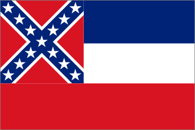
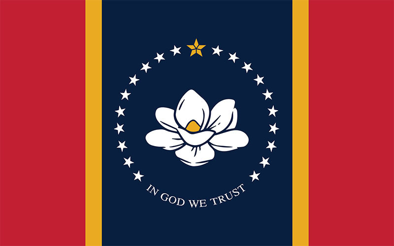
Like colors, symbols are interpreted differently by individuals on the basis of their personal and cultural experiences. Above is an example of two state flags with very different symbolism. The first image (Fig 18.5) depicts an older version of the Mississippi state flag (adopted in 1894); the second image (Fig 18.6) depicts the current version (adopted in 2021).
In 2021, under pressure from numerous organizations and in the wake of the Black Lives Matter movement, Mississippi replaced its state flag. The 1894 flag included the battle flag of the Confederacy, referencing Mississippi’s history of secession and violence during the Civil War (1861–1865); the single blue, white, and red bands were a reference to the stripes on the American flag. This historical allusion, coupled with the state’s history of enslavement and segregation, meant that the 1894 flag served as a stark reminder of efforts to silence Black Mississippians. In fact, Mississippi did not formally ratify the Thirteenth Amendment to the Constitution — proposed in 1865 to abolish slavery — until 2013, and the state remained segregated long after the Supreme Court outlawed the practice.
Mississippi continued to use the 1894 flag throughout the Reconstruction (1865–1877) and the Jim Crow (ca. 1877–c. 1950) and Civil Rights (1950s and 1960s) eras despite multiple and sustained efforts to remove any reference to the Confederate flag. In 2020, the increasing prominence of the Black Lives Matter movement created the context in which state lawmakers were forced to consider these problems as mainstream and urgent. Further, the state came under pressure from numerous organizations, including the Southeastern Conference athletics organization (SEC), which threatened to boycott the state by no longer holding major events there if the flag were not changed.
Submitted to the legislature by Starkville-based graphic designer Rocky Vaughan (b. ca. 1977) and collaborators Sue Anna Joe, Kara Giles, and Dominique Pugh, the new flag took effect in January 2021 after voters approved it and the governor ratified it. The current flag features a central vertical band of blue, flanked by two thin gold bands and encompassed by two broader red ones. The flag’s center is dominated by a single magnolia flower, crowned by a single gold star and encircled by 20 white ones. Beneath the flower are emblazoned the words “In God We Trust.”
The gold coloring is intended to celebrate Mississippi’s contributions to the world of art, music, and literature. The white stars symbolize Mississippi’s status as the 20th state of the Union; thus, the new flag symbolizes the state’s reintegration into the Union without reference to its seditious acts in the 19th century or lingering loyalty to the beliefs that motivated them. In addition, the single gold star honors the state’s Indigenous people; no reference is made to the state’s history of enslavement and racism.
Thinking critically about color and symbol, ask yourself the following questions:
- Does the color enhance or distort the reality of the image?
- Imagine the image in shades of black, white, and gray — what would be lost and what would be gained if color were subtracted?
- Does the color work with or against the other compositional elements?
- What symbols are incorporated into the image? How might those symbols be interpreted in various contexts?
- What, if any, is the significance of referencing Indigenous but not Black Americans on the current flag?
Questions to Consider for Visual Analysis
- What is the rhetorical situation (audience, context, content, genre, and author)?
- What gut reaction do you have to the image (joy, fear, indifference, etc.)?
- What is the central focal point? Does anything immediately attract your attention, either through its presence or absence?
- How is color used? Does it convey symbolism or impact the mood of the visual?
- What is the social, cultural, and historical context of the image? Does the image continue to circulate over time and fulfill a role in the production of culture?
- What figures appear in the image? Can you identify their age, ethnicity, social class, or profession? Do any of these elements contribute to the visual’s meaning?
- Does the visual text reflect stereotypes about race, gender, or other identifiers?
- Do the figures’ facial expressions or appearance suggest interpretations consistent with the apparent message of the visual text?
- Does the image suggest what may have preceded or followed the moment captured in the photo?
- What does the image convey that would be difficult to communicate with words alone?
- Is there a caption? If so, does it effectively add to or help explain the image?
- Consider the rhetorical appeals (ethos, logos, and pathos). Which does the image use? How?
- What is the prevailing tone of the image? Is it consistent with the intended message?
Assignment: Analysis of an advertisement
Thoughts
Advertising often takes the form of written communication. It often attempts to appeal to our emotions, prompting us to imagine how our lives could be better, either physically or mentally (i.e., physical: think of the “soft leather interior” of that new Lexus, or mental: imagine relaxing on a cruise ship). Like all texts, advertisements often work on multiple levels. Advertisers often use symbols, metaphors, clichés, and emotions (to name only a few) to appeal to a specific audience. An ad may be showing you one thing, but advertisers are hoping that you’re thinking of something else (i.e., surface level: “Drink our beer, it tastes great;” implied level: “Drink our beer and you’ll be more attractive to women.”)
Rhetorical analysis of visual texts: “Just as with verbal texts, we need to understand how visual texts [like ads] work in rhetorical ways to achieve particular purposes and how they work to convey meanings that relate to the context in which they are realized” (Rhetoric). You will be closely “reading” an ad to discover how it attempts to persuade its target audience.
Prompt
Analyze the rhetorical appeals featured in one print advertisement of your choice.
Your ad:
- Can be from a magazine.
- Can be from a Google search (search brands like Dolce & Gabbana, Calvin Klein, Carl’s, Jr., Toyota, Porsche, etc., or search by topic: “make-up ads,” “muscle ads,” “controversial ads,” “clothing ads,” etc.
- Must be a modern ad for a purchasable product.
Misc
- Your analysis should include an introduction, a thesis, multiple body paragraphs, and a conclusion. The ad needs to be included (copied and pasted onto the last page of the essay).
- Your thesis needs to include the implicit message of the ad and the emotional appeals used by the ad (use no more than three emotional appeals).
- Sample thesis: The ad for Cover Girl Long-Lasting Lipstick appeals to the need to achieve, the need for sex, and the desire for aesthetic perfection. It does this to make women feel obligated to purchase the product in order to fit into society. The ad also uses specific colors and word choices to emotionally manipulate the audience.
- Once you have analyzed the ad according to the emotional appeals, you may also include other appeals that may not fit under the list (use of color, word choice, organization, balance, juxtaposition, light, repetition, use of clichés, or figurative language, etc.)
- You must establish the target audience in the first or second paragraph and explain how you know who the target audience is.
- Your last body paragraph or the conclusion should include your verdict on whether or not the ad is effective for the target audience.
Specifics
- Your analysis should be 2.5-3 pages long.
- Use MLA format: double-spaced; Times New Roman; 12-pt. font.
- The essay should be written in third-person academic voice (avoid “I” or “you”).
Student Example 1: Riana Saint Rhetorical Analysis of an Ad Essay [Website]
Student Example 2: Max Suarez Rhetorical Analysis of an Ad Essay [Website]
Works Cited
Bruno. “Colored pencils.” Pixabay, pixabay.com/photos/colored-pencils-pencils-crayons-3682424/.
Dehejia, Vidya. “Chaddanta Jataja Amaravati.” Wikimedia Commons, CC0, commons.wikimedia.org/wiki/File:Chaddanta_Jataja_Amaravati.jpg.
Kendall, K. “DSCF1343.” Wikimedia Commons, CC BY 2.0, commons.wikimedia.org/wiki/File:DSCF1343_(50265333493).jpg.
Laurencic, Una. “Woman Sitting on Ottoman in Front of Three Paintings.” Pexels, pexels.com/photo/woman-sitting-on-ottoman-in-front-of-three-paintings-20967/.
Ndongala, Nelson. “Megan Rapino for Nike.” Unsplash, unsplash.com/@whodunelson?utm_content=creditCopyText&utm_medium=referral&utm_source=unsplash.
Palmero, Nan. “Kodak Digital Waterfall.” Flickr, CC BY 2.0, www.flickr.com/photos/nanpalmero/4278445589/in/gallery-51646223@N04-72157624398600092/.
Saint, Riana. “Perfume and Persuasion: A Rhetorical Analysis of How Advertising Captivates Our Senses.” Rhetorical Analysis of an Ad, 26 Mar. 2025.
Saura, Jose Francisco Fernandez. “Street Lights.” Pexels, pexels.com/photo/street-lights-802024/.
Suarez, Max. “Illuminating Persuasion: A Rhetorical Analysis of the BIC EZ Reach Lighter Advertisement.” Rhetorical Analysis of an Ad, 26 June 2024.
Vaughan, Rocky, et al. “Flag of Mississippi.” Wikimedia Commons, Public Domain, commons.wikimedia.org/wiki/File:Flag_of_Mississippi.svg.
Wikimedia Commons. “Flag of Mississippi (1894–1906).” Wikimedia Commons, Public Domain, commons.wikimedia.org/wiki/File:Flag_of_Mississippi_(1894%E2%80%931906).png.
Image Descriptions
Figure 18.1. Side-by-side images of the same circular stone relief from the Amaravati Buddhist site (late BCE–early CE). The left image is a grayscale photo of the weathered medallion densely carved with elephants, trees, and human figures arranged in tiers around a central standing figure. The right image is a black-line tracing of the relief that clarifies the scene and marks the narrative sequence with numerals—2, 3, 4, 5, 6—placed on key elephant groups and areas. The outline shows how viewers are meant to “read” the composition by following the numbered parts around the medallion. [Return to Figure 18.1]
Figure 18.3. A busy expo booth features a long horizontal glass touchscreen branded Kodak. Several attendees stand along the edges swiping and tapping as animated circles, camera icons, and photo thumbnails slide across the surface toward a vertical display at the far end, creating a waterfall-like flow of content. The booth is dimly lit, with red Kodak signage on the back wall and on the interface; additional text and product names appear on the table but are mostly unreadable in the photo. [Return to Figure 18.3]
Figure 18.4. A brick wall beneath a bridge holds several posters. In the center, a large billboard displays the Gaza Strip mural, an illustration of yellow bulldozers and green dump trucks driving around a gray roadway shaped like a figure-eight, suggesting an endless cycle. To the right, a brightly colored poster reads “EVERY THURSDAY MISLED @ LIQUID & ENVY ROMFORD … LADIES FREE B4 10, ALL DRINKS £2.” Other ads are partly visible on the left. Sunlight cuts across the pavement, and parts of parked cars frame the scene; TAXIS is painted on the roadway. [Return to Figure 18.4]
Attributions
This chapter was remixed by Phil Choong and Melisa Garcia.
Writing Guide with Handbook by Michelle Bachelor Robinson, Maria Jerskey, featuring Toby Fulwiler is licensed under CC BY 4.0.
“Rhetorical Analysis of Visual Texts” by Shelley Decker, Kolette Draegan, Tatiana Keeling, Heather Moulton, Lynn Gelfand is licensed under CC BY-NC-SA 4.0.
Media Attributions
- Visual Analysis Figure 14-2
- Kodak Digital Waterfall
- Figure 14-4
- colored-pencils-3682424_1280
- Figure 14-5
- Figure 14-6

.jpg)
.png)